A farm product company struggled with ineffective marketing materials that failed to communicate product benefits and generate customer inquiries. We completely reimagined their flyer design using strategic typography and visual hierarchy, transforming it from ignored collateral into a high-performing sales tool that dramatically increased engagement.
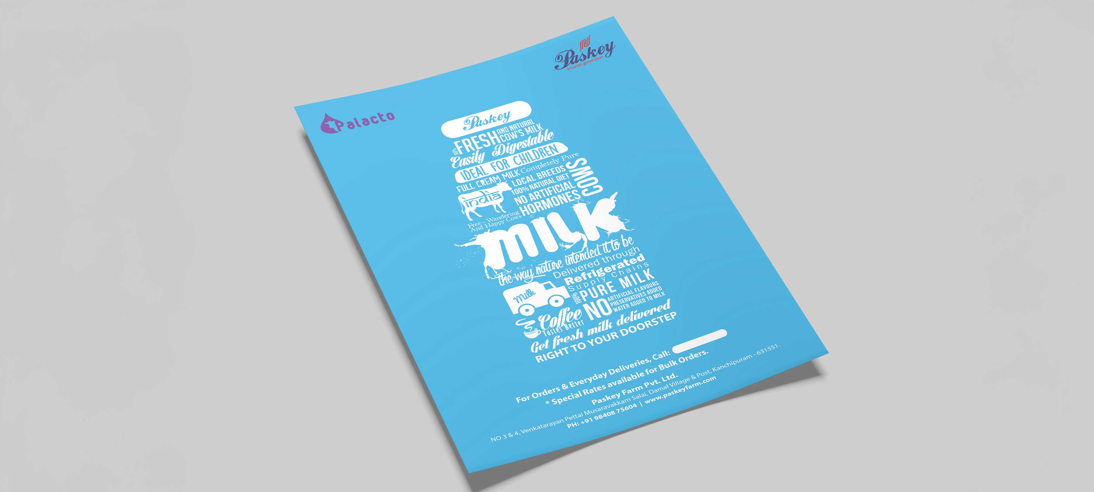
The client faced a frustrating reality: they had quality farm products but their marketing materials were actively hurting sales. The original flyer design was dense, difficult to read, and completely failed to capture attention in the crucial first seconds of viewer interaction. In the agricultural products space, where customers often compare multiple suppliers and make quick decisions based on available information, poor communication materials can be the difference between winning and losing business. The flyer needed to work harder—quickly communicating product benefits, building trust and credibility, standing out in a market filled with generic agricultural marketing, and ultimately driving inquiries and sales conversations. The challenge wasn't just aesthetic; it was strategic: how do you take complex product information and make it instantly digestible and compelling for busy farmers and agricultural buyers who are evaluating multiple options?
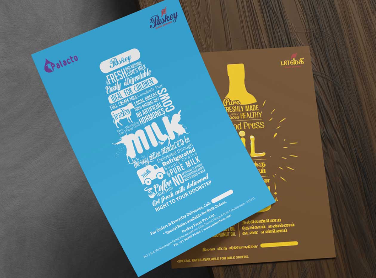

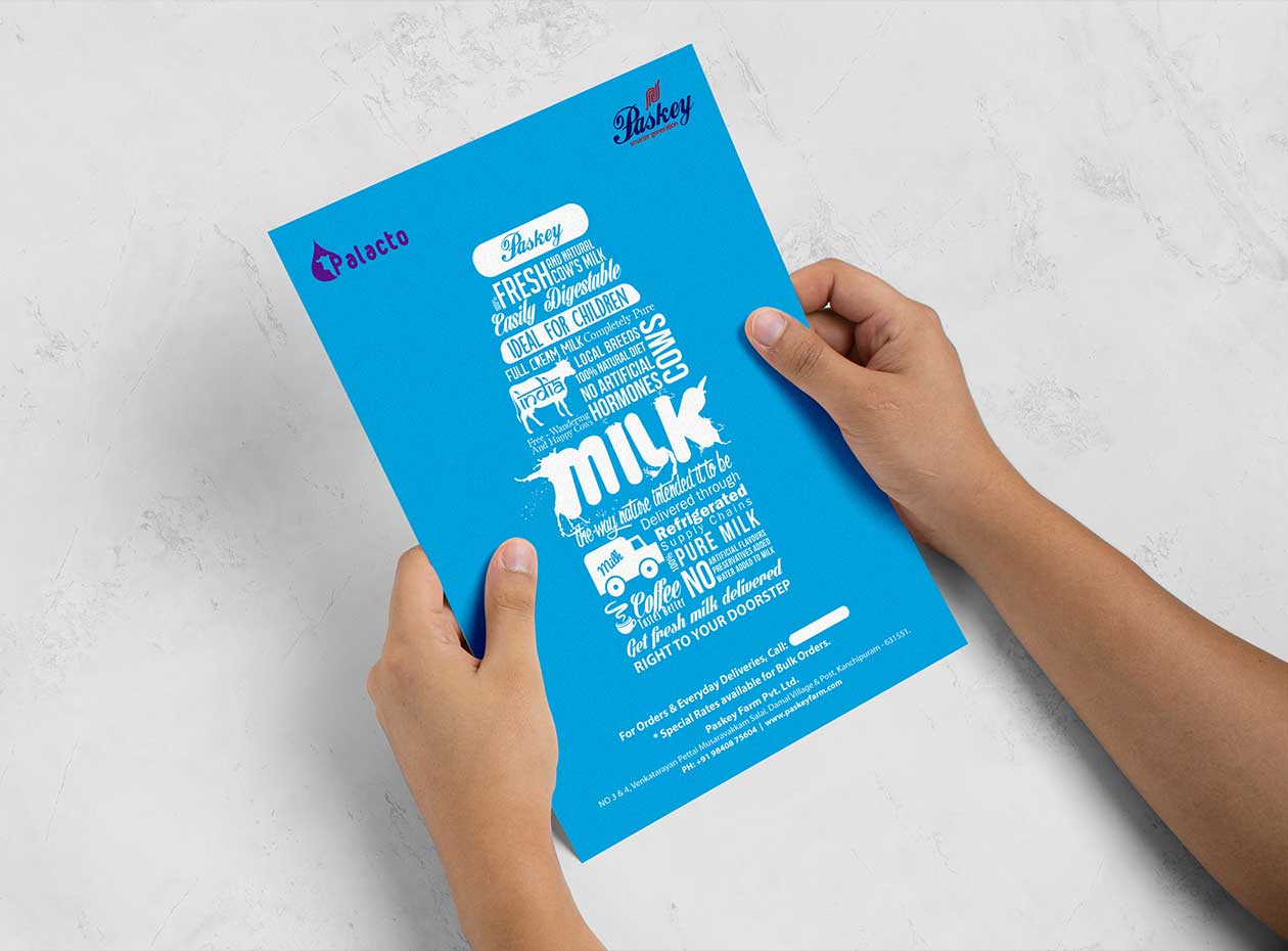
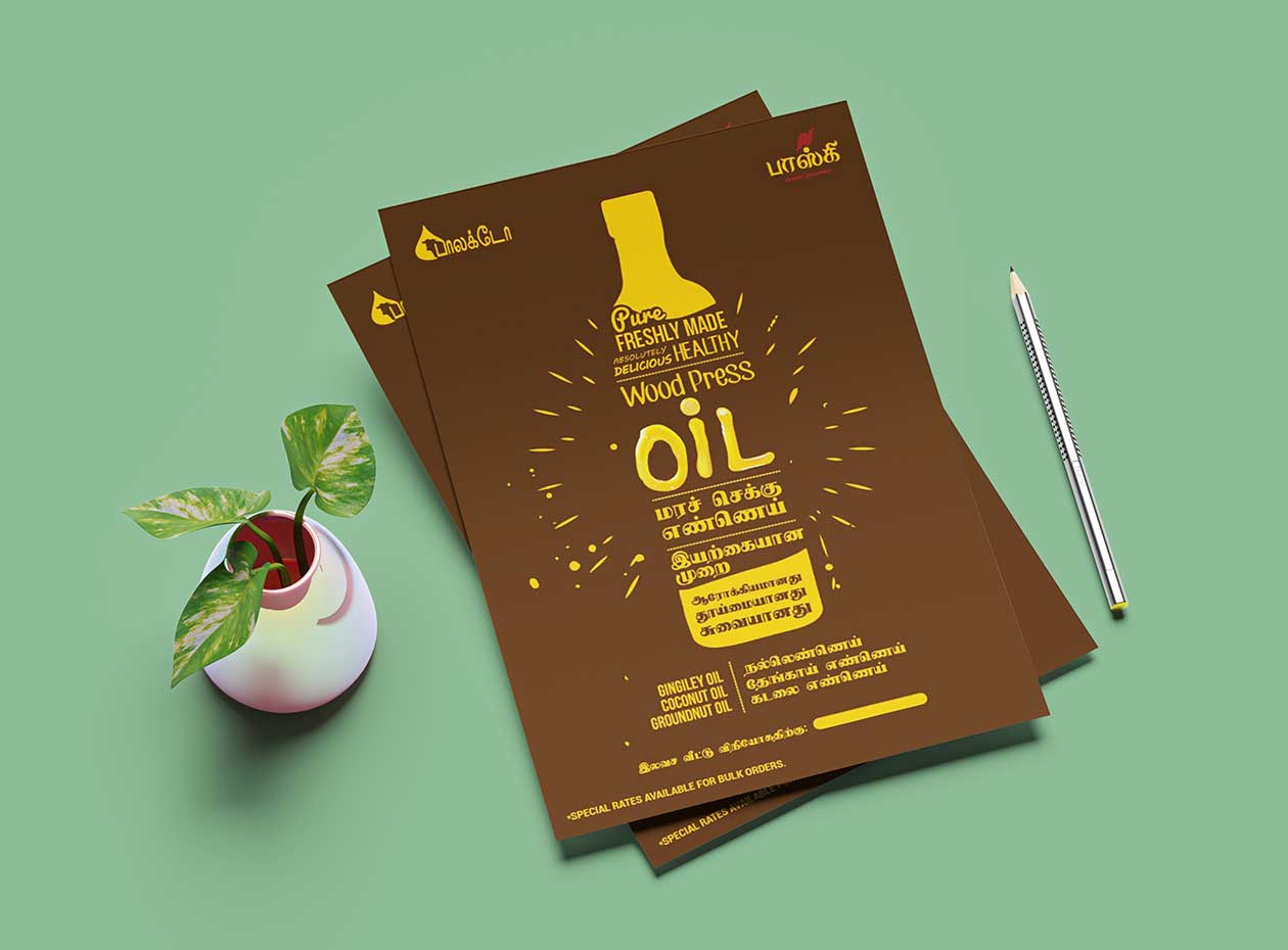
The client's farm products were high-quality, but their marketing materials told a different story. The original flyer was working against them—cluttered layout, poor typography, and unclear messaging meant potential customers couldn't quickly understand the product value proposition.
Our strategic approach began with understanding the customer journey: agricultural buyers typically review multiple suppliers quickly, making snap decisions based on clarity and perceived credibility. The flyer needed to communicate value in seconds, not minutes.
The redesign focused on strategic typography and visual hierarchy to guide the viewer's eye and make information instantly scannable. We restructured content to lead with benefits rather than features, used type scale and weight to create clear information layers, and employed white space strategically to improve readability and focus attention on key messages.
This wasn't just making things "look prettier"—it was strategic communication design that understood buyer psychology and decision-making patterns in the agricultural space. Every design choice served the goal of converting viewers into inquirers.
The result: an 800% increase in customer inquiries. The redesigned flyer transformed from ignored collateral into a high-performing sales tool. By focusing on strategic visual communication rather than decorative design, we turned marketing materials from a liability into an asset that actively drives business growth.