Women Making Films, a not-for-profit community founded by Vaishnavi Sundar, needed a brand identity that would represent their mission of connecting and showcasing women filmmakers through interactive programs. We created a powerful visual identity that merged feminine symbolism with cinematic artistry, becoming a rallying symbol for women's creativity in the film industry.
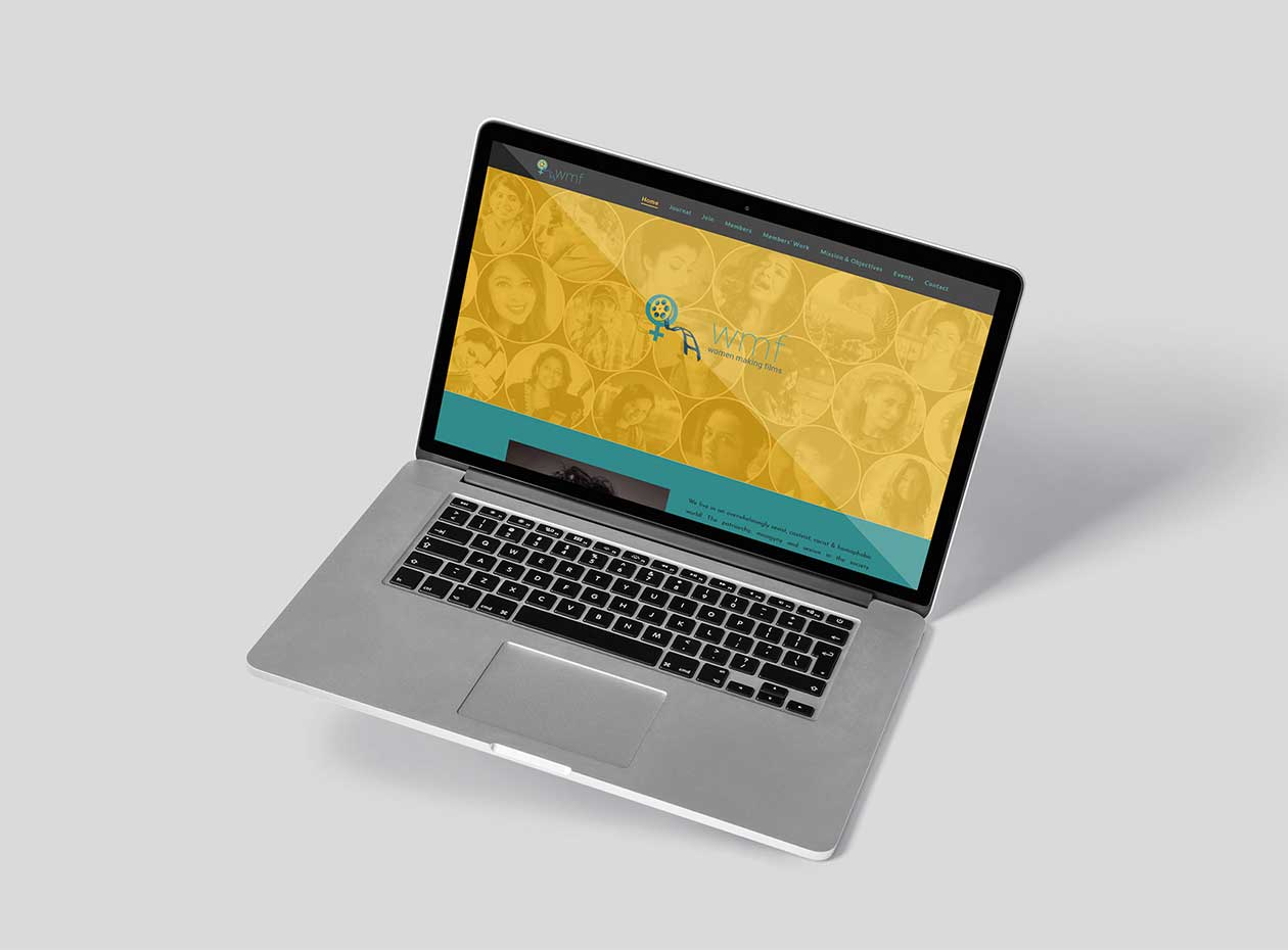
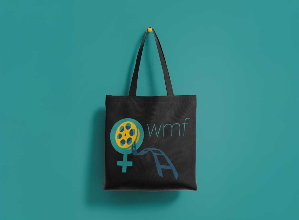
Women Making Films faced the challenge that many mission-driven organizations encounter: how to create a brand identity that inspires rather than just identifies. They needed a visual system that would resonate deeply with women filmmakers at all career stages—from emerging talent to established professionals—while being sophisticated enough to attract industry partnerships and sponsors. The identity had to avoid clichés often associated with women-focused initiatives (overly soft, stereotypically feminine, or conversely, aggressively combative) while still proudly celebrating women's contributions to cinema. It needed to work across diverse applications—from social media and event materials to film festival presence and partnership presentations—all while operating within the budget constraints typical of not-for-profit organizations. Most critically, the brand needed to feel like a beacon and gathering place for a community, not just a corporate logo.
Women Making Films needed more than visual branding—they needed a symbol that could unite and inspire a growing community of women filmmakers while establishing credibility in a traditionally male-dominated industry.
Our strategic approach focused on balancing strength with creativity, professionalism with warmth, and contemporary design with timeless symbolism. We needed to create an identity that women filmmakers would proudly associate with while appealing to industry stakeholders who could provide opportunities and partnerships.
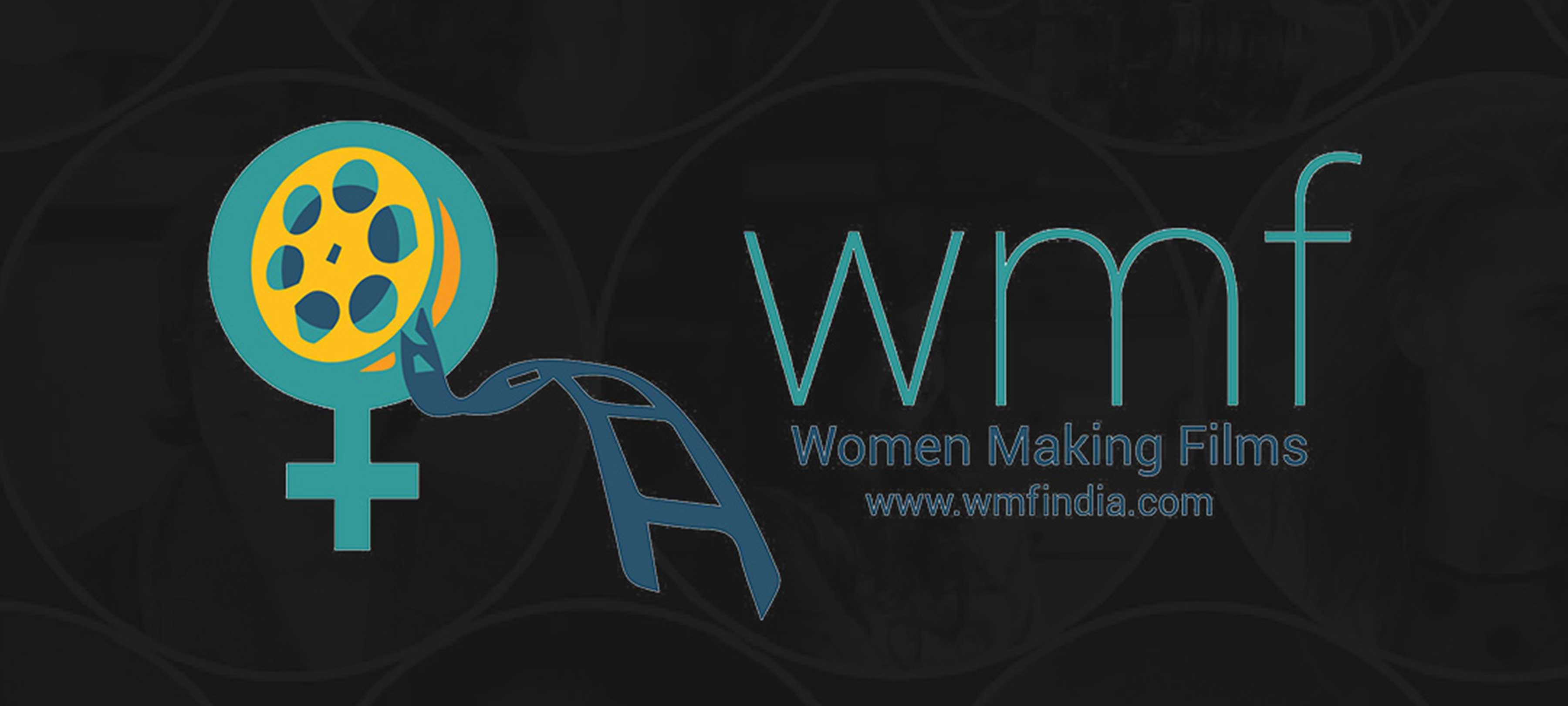
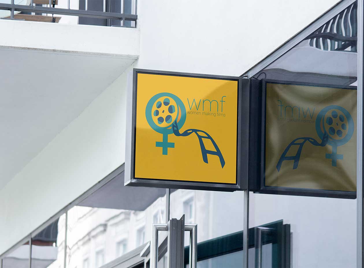
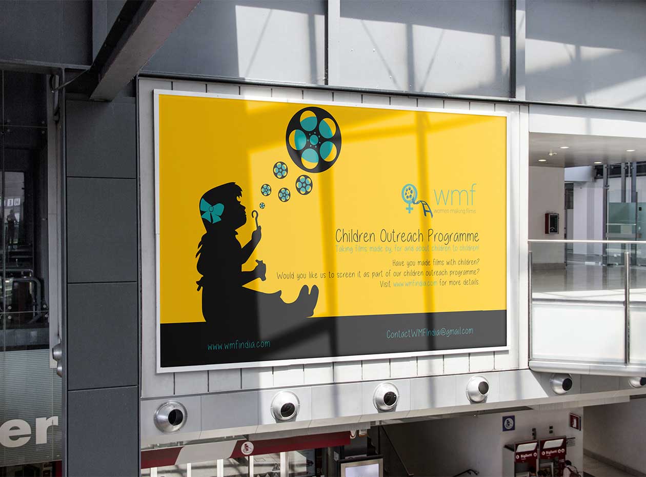
The breakthrough design concept merged the Venus symbol with a film reel—a elegant integration that celebrated both feminine identity and cinematic craft. This wasn't just clever visual play; it was strategic positioning that said "women" and "filmmaking" are inseparable, not competing concepts. The symbol communicated that this community proudly centered women's perspectives in cinema.
The color palette of yellow and green was deliberately chosen to represent creativity and growth—the core attributes of the community's mission. These colors provided energy and optimism while remaining sophisticated and professional for industry contexts.
The result: a versatile, impactful brand identity that resonated immediately with community members and supporters. The logo became more than identification—it became a rallying symbol for women's creativity and growth in film. The identity successfully positioned Women Making Films as a credible, professional community while maintaining the warmth and accessibility essential for grassroots movement-building.