Urban Shark needed to transform from a mid-to-large home interior design company into an integrated ultra-luxury property solution serving India's top 1% across realty, construction, and interiors. We repositioned the entire brand to communicate trust, luxury, and design innovation through a sophisticated visual identity system that elevated their market positioning from service provider to elite partner.
Urban Shark faced a critical business transformation challenge: repositioning from a Chennai-based interior design company serving the mid-to-large home segment into an integrated ultra-luxury property solution for India's top 1%. This wasn't a simple brand refresh—it required a complete strategic repositioning that would instantly communicate a dramatic shift in market tier and service scope. The new identity needed to establish trust with ultra-high-net-worth clients who demand perfection, convey genuine luxury without appearing ostentatious or trying too hard, signal design innovation and architectural sophistication that appeals to discerning clients, and work seamlessly across three distinct business verticals: realty, construction, and interiors. The brand had to shed its previous mid-market associations while maintaining continuity with the Urban Shark name. Most critically, it needed to compete visually and strategically with established luxury property brands while establishing credibility in a segment where reputation and perceived expertise are paramount.
Urban Shark's transformation required more than a logo redesign—it demanded a complete strategic repositioning that would convince India's wealthiest 1% that this was their ultra-luxury property partner.
Our strategic approach began with understanding the ultra-high-net-worth mindset: these clients don't just buy services, they select partners. The brand identity needed to communicate architectural mastery, uncompromising quality, and sophisticated design thinking before any conversation begins.
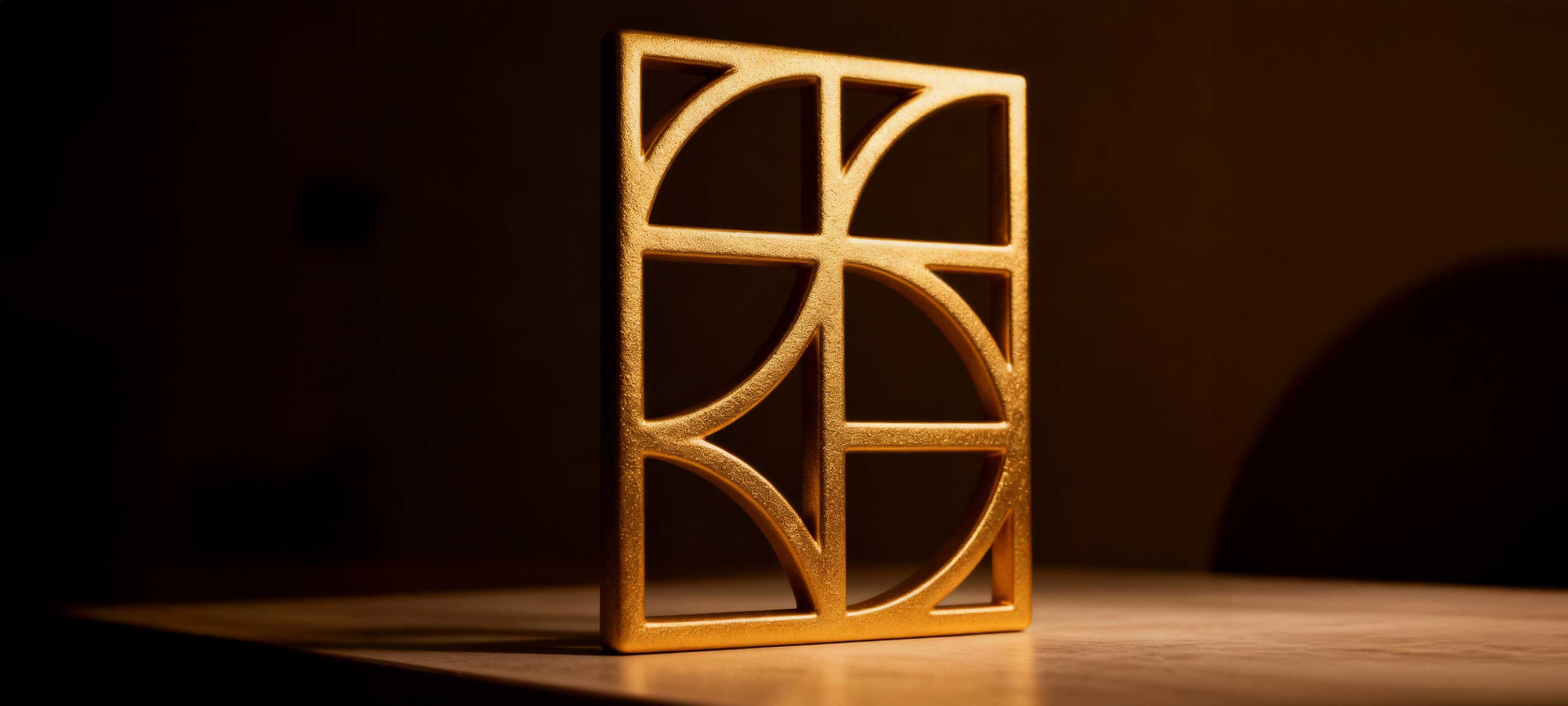
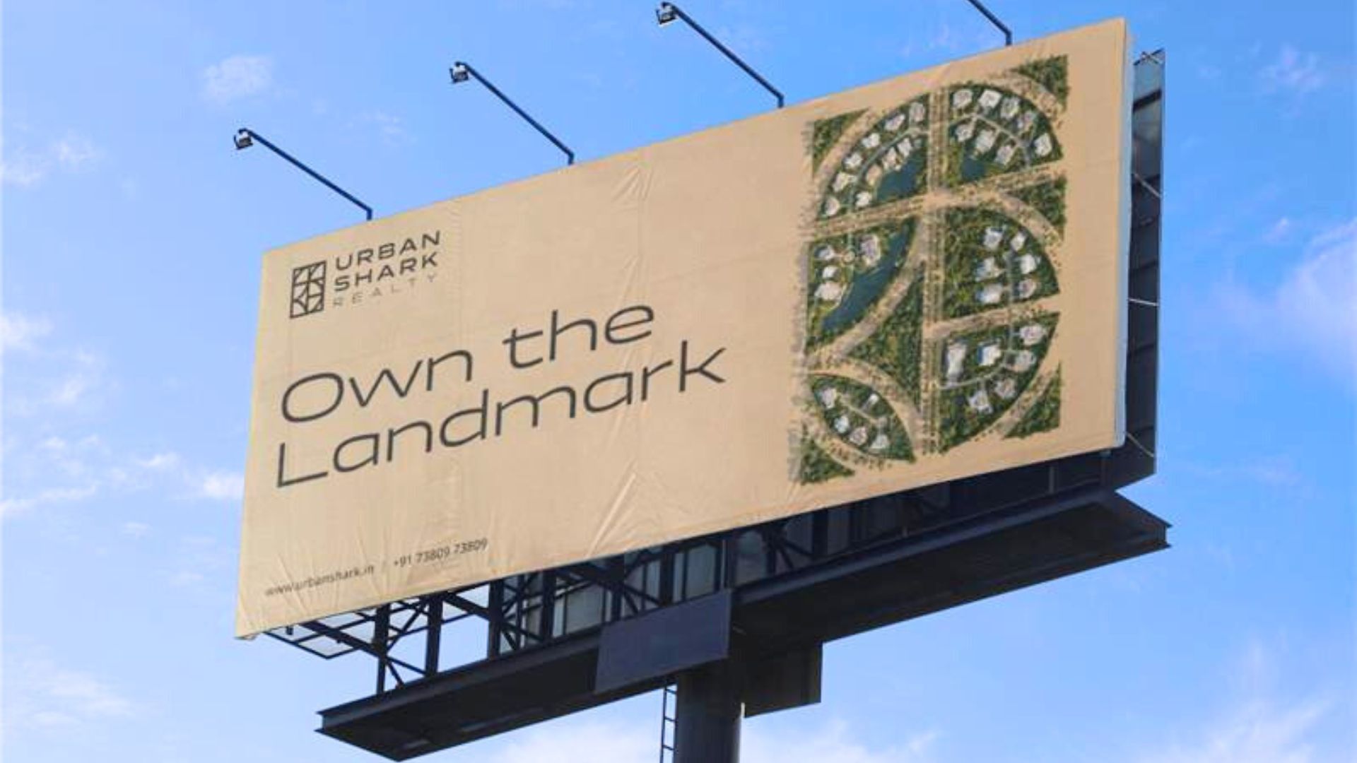
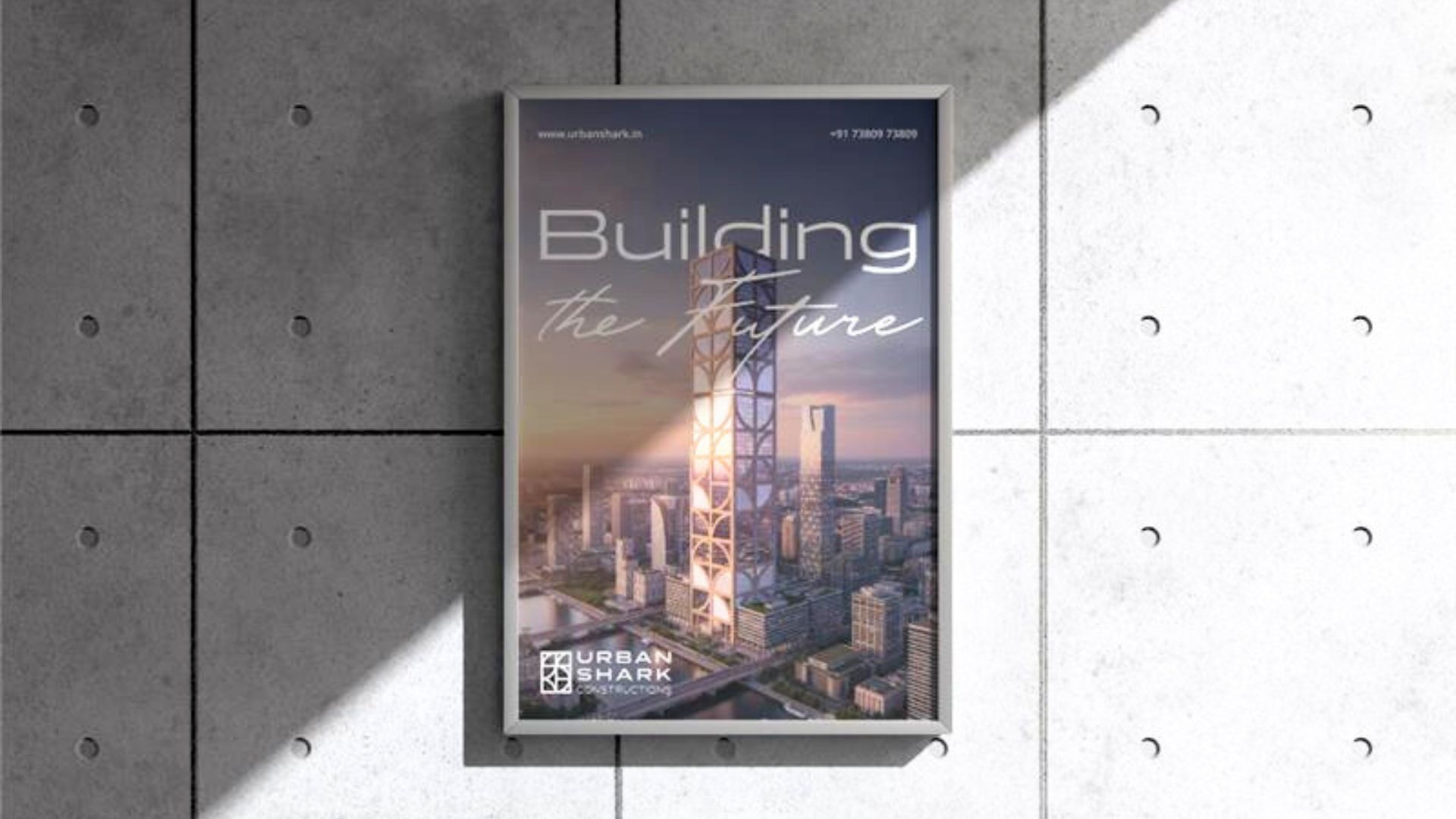
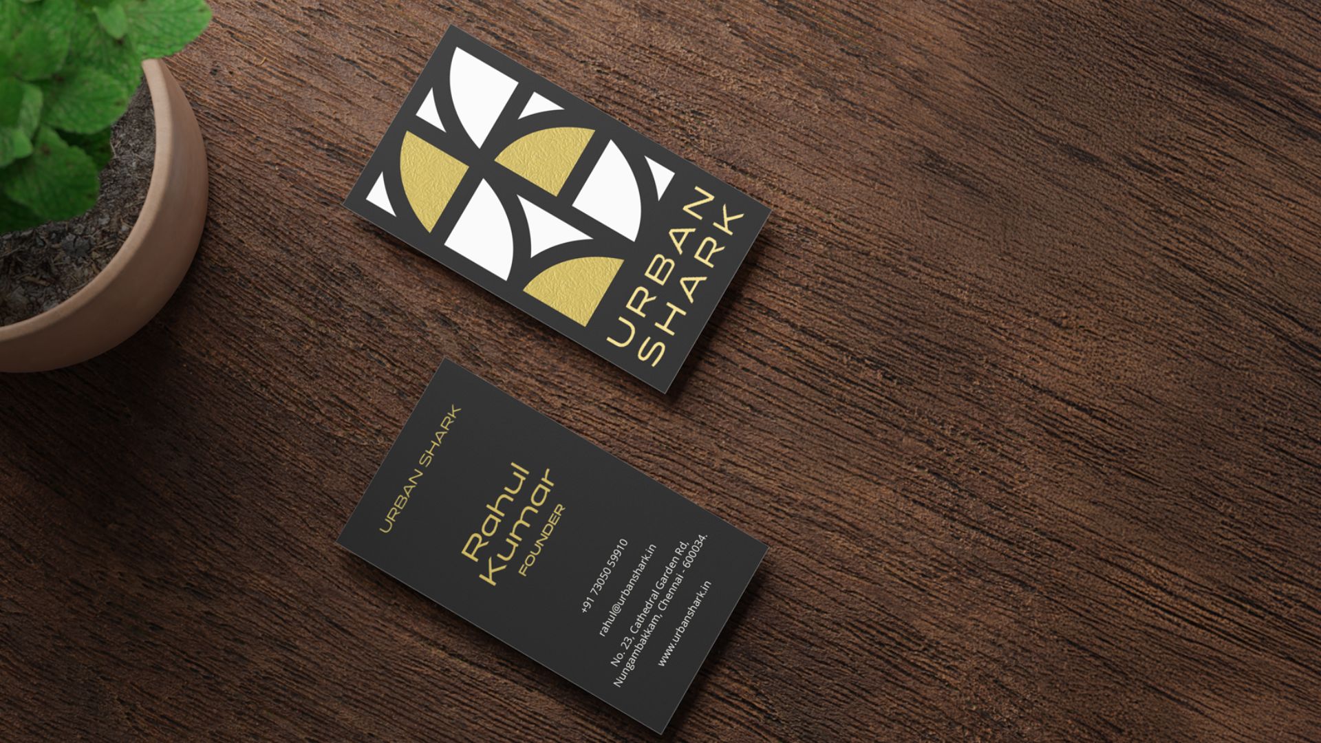
The logomark solution centered on a grid-inspired composition crafted from the same strokes, curves, and angles that form the brand name letters. This approach served multiple strategic functions: evoking modular design systems used in architecture and urban planning, speaking to craftsmanship and intentionality where every element has purpose, incorporating repetitive curves representative of the shark fin, and creating bold rectilinear forms that echo city grids, blueprints, and structural frames.
The typography was carefully selected—a modern sans-serif that resonates with the logomark's geometry, creating visual synergy. Bold, sleek, and contemporary, it communicates the urban sophistication expected by elite clients.
The result: a sophisticated brand identity that successfully repositioned Urban Shark from interior design company to integrated ultra-luxury property solution. The visual system communicates trust, innovation, and architectural excellence—exactly what India's top 1% expects from their property partners. The brand now competes credibly in the ultra-luxury segment across realty, construction, and interiors.